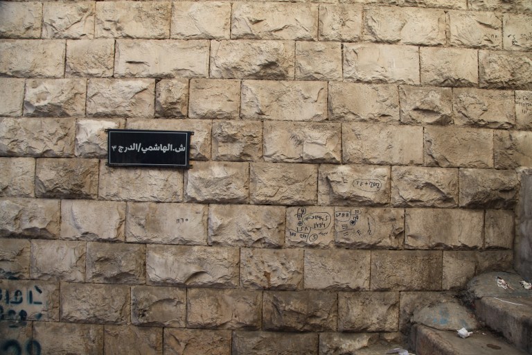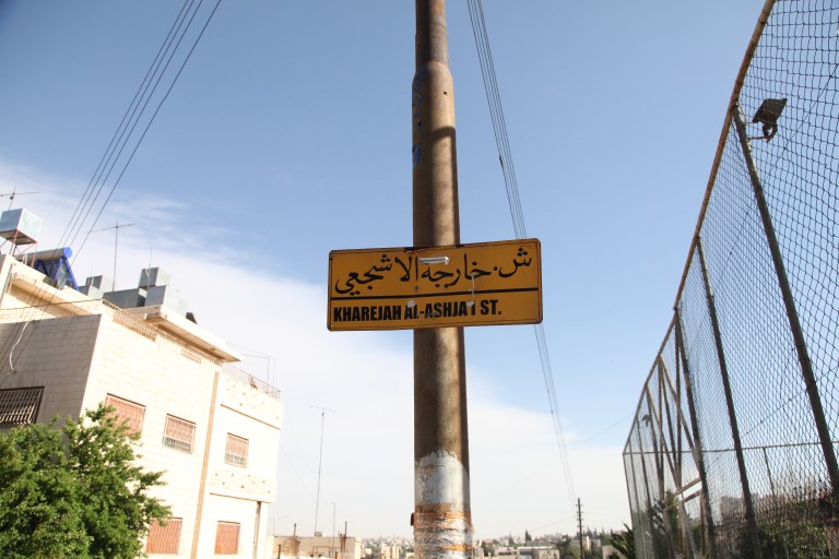
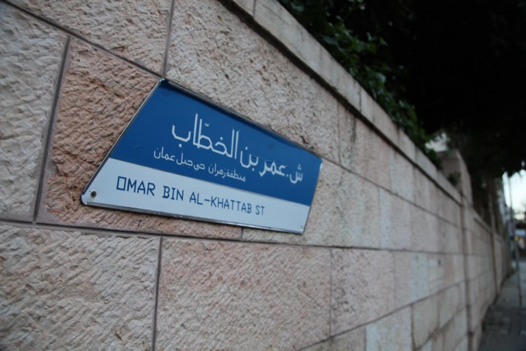
Variations in the shape, color, and fonts of urban wayfinding. While an interesting contrast to other contexts’ strict uniformity, I can’t help but wonder about the consequences for Amman’s accessibility/legibility, when the design of signs change between one side of a street and another (as shown by the first two photos).