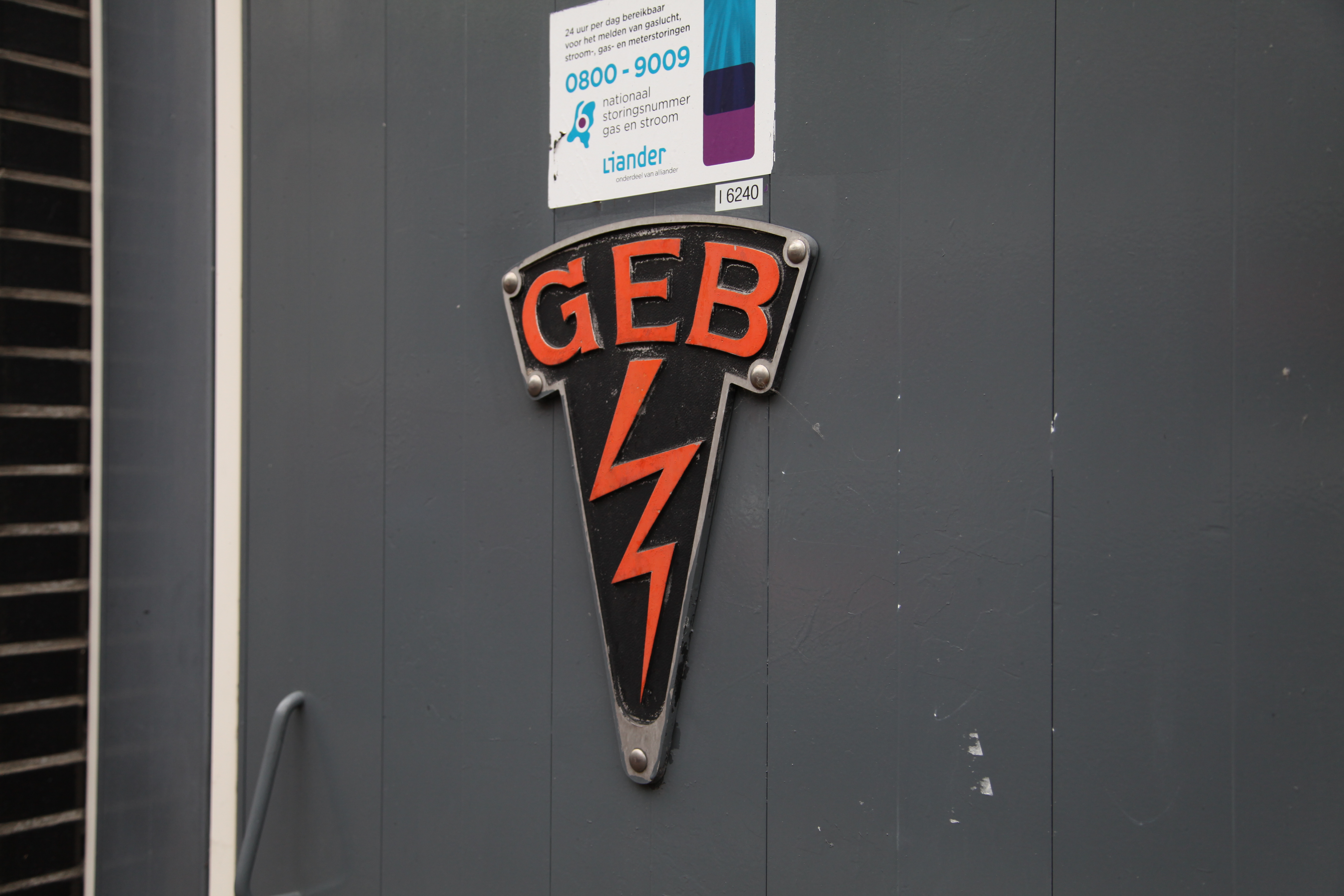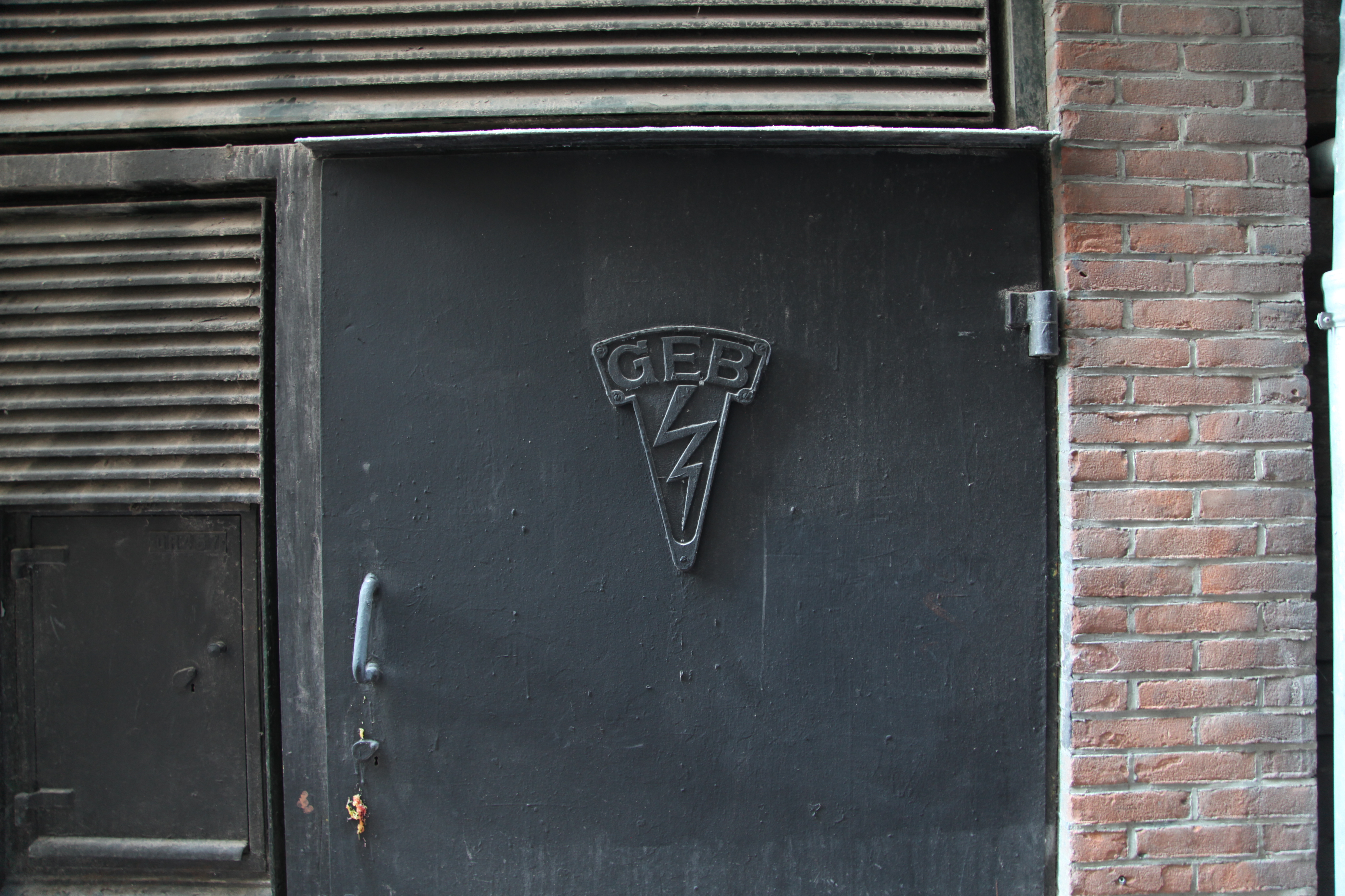
These days, the physical/digital divide is the main determinant of how a brand must flex across media – how a logotype appears in print versus how it looks in pixels. The branding for Amsterdam’s former electrical supply company, GEB, appears to have employed a more laid-back approach to enforcing brand guidelines before undergoing several acquisitions and mergers and its old infrastructure falling under ownership of Liander, an independent grid operator, in 2002.
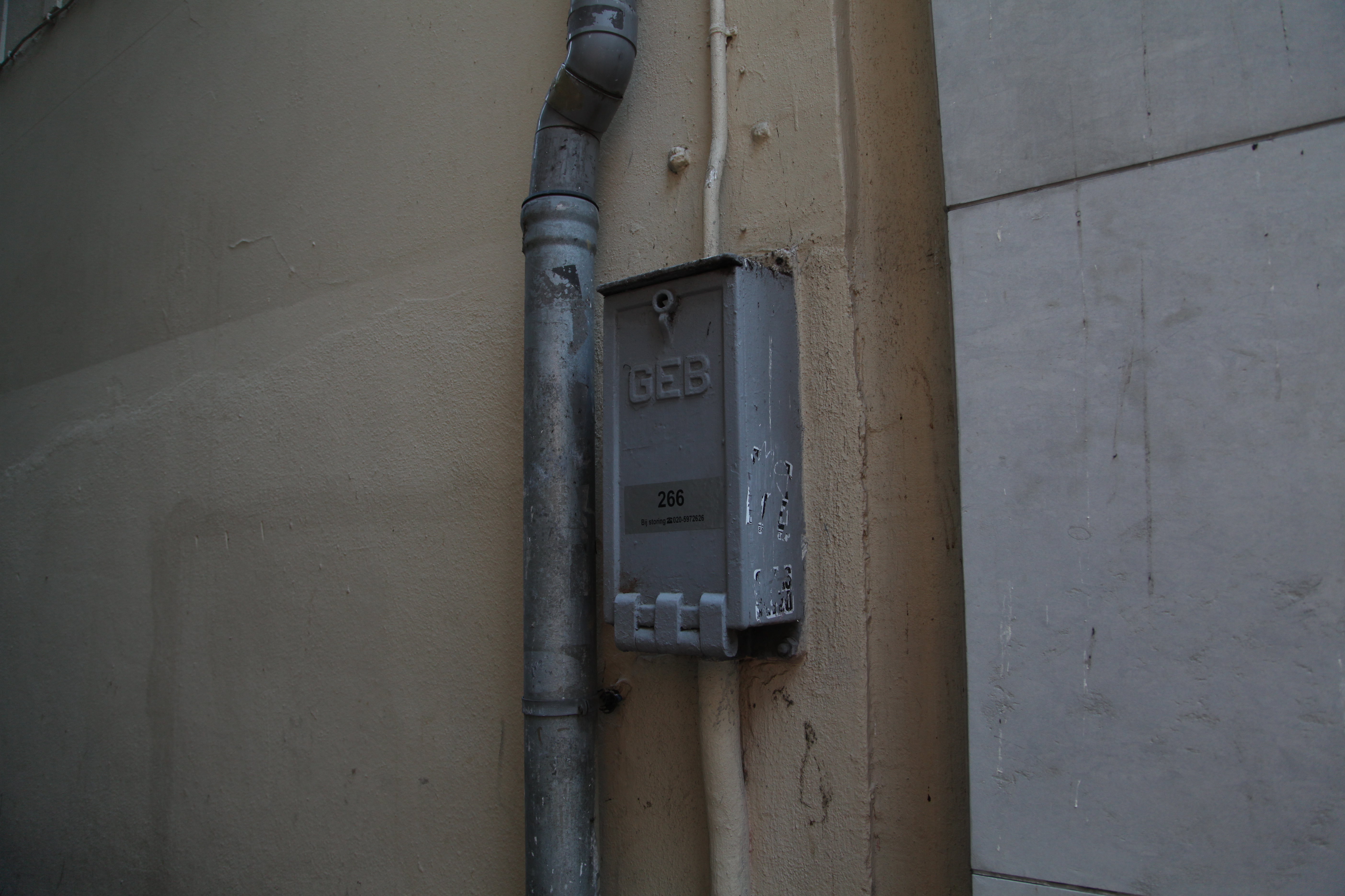

Perhaps the longer time horizons and deeper complexity of providing electricity to this centuries-old city of canals forced the organization to adopt a more fluid and chameleonic strategy for its logo, from camouflaging subtly into the background in some cases (though it is distinctly possible that somewhere under several coats of exterior paint is the “authentic” original layer of color), to at other times boldly announcing its presence with red serifs and matching lightning bolt.