
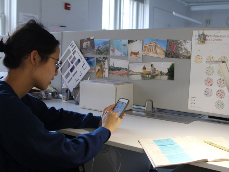
I worked on a team of four to develop a mobile application that helps the many stakeholders involved in a student’s well-being (parents, teachers, therapists, guidance counselors, etc.) better coordinate with and update each other about the students with whom they work. My responsibilities for this project included the development of the “Meeting” page, where users could view upcoming meetings and schedule new meetings, and also the creation of the final client presentation.
This compressed one-minute excerpt of the final presentation demonstrates how I animated the story our group wrote to illustrate how the mobile app is used in context. This excerpt also shows my facility with Keynote prototyping, and the ability to weave it into a narrative-supporting role.
role
Our team collaborated to determine which features to prioritize and the general appearance of the app. I took responsibility for creating multiple iterations of the calendar and event scheduling function, and for creating the final presentation using Keynote, as well as iterations upon our team’s feature-value matrix and sitemap.
expertise
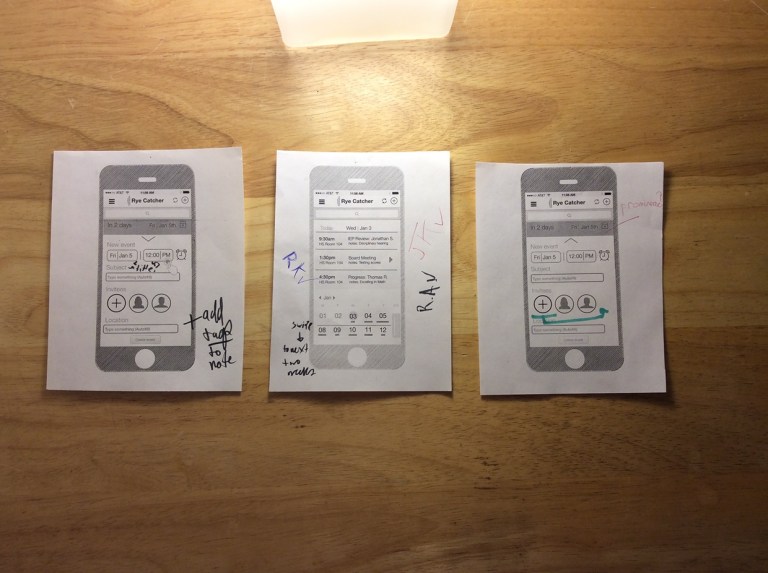
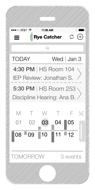
The main visible variation between these evolving wireframes was the variety of approaches I took to inform users about the best day on which to schedule a meeting with only a quick glance. Throughout the process, I tried to balance the need to show upcoming engagements with the need to quickly schedule a new one, testing each subsequent design with users and iterating upon them based upon their feedback. For example, although we set out assuming we would design a single way to view the calendar, through user feedback we decided to design multiple views, making the page adjustable to show different timelines and different emphasis on the calendar versus upcoming events. I ended up designing a a one-week, two-week (see above), and month view.
These wireframes demonstrate my comfort with wireframing software (Omnigraffle, in this case), and the ability to fold critiques around style and visual hierarchy into various iterations of a mobile app. Finally, the excerpt of the presentation shows both my ability to compellingly animate and present a story, and also demonstrates my ability to animate a prototype of a mobile app in Keynote and weave it into a narrative.
process
For this project we first worked with the client to scope our engagement and consulted with subject matter experts to understand the state of the art in education apps and the broader educational landscape. Next, our team dove into several tight loops of prototyping, testing, and iterating upon our wireframes.
scoping
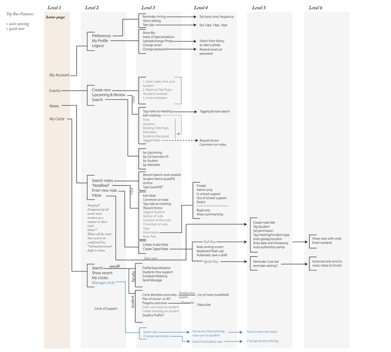
Through an ongoing conversation with the client, as well as subject matter experts in the fields of education and mobile development for youth, we developed this sitemap that demonstrates the information architecture of our proposed mobile application. This sitemap captures the overall flows, and also physically demonstrates our goal of keeping functionality close to the surface, ensuring each of the task trees were well-integrated with each other and that navigation between them was simple. Adhering to this design principle of “shallowness” (easy connection between different functions within the app through menus and links) was a priority, as we’d heard from both users and experts that there was frustration around the need to switch between multiple apps to accomplish a single task.
prototyping (sketches)
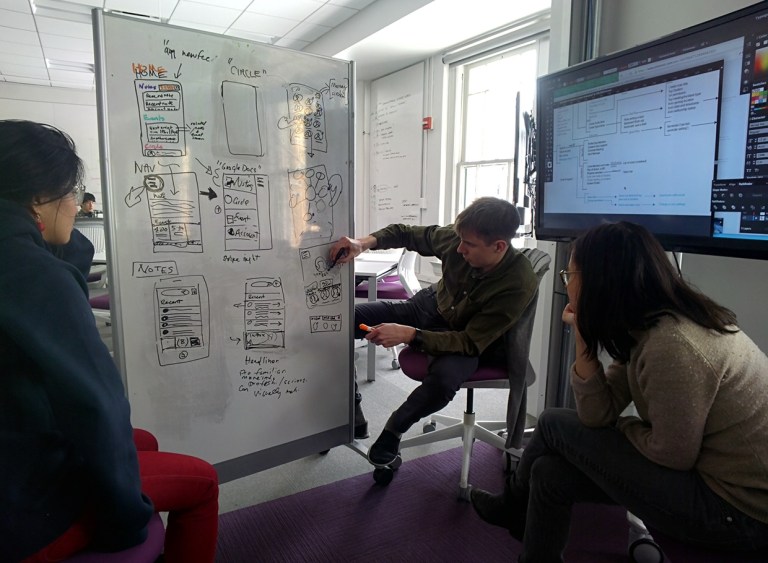

Higher-level, rough whiteboard sketches of how the proposed “Events” page would look, feel, and be connected to other pages, as well as additional thoughts around how to add an event and some potential calendar configurations for further exploration.

Some individual sketches and musing around how to convey the relative “density” of events on a given day with only a quick glance at a phone screen-sized calendar.
prototyping (early digital)

Once we had designed initial rough wireframes of several of the main pages of our app using Omnigraffle, we conducted a sort of “public paper prototyping” exercise with our peers to get their feedback. To do this, we pinned up printouts of wireframes we had made, and then guided our colleagues through the flow of the app and our reasoning behind our design decisions. We encouraged them to write feedback directly on to the printouts of the designs, as seen above.
The results of some paper prototyping we did with our colleagues to see their reactions to the different calendar configurations and activities within the “Meeting” section of the app.
Using the app POP (Prototyping on Paper), we placed our Omnigraffle-drawn wireframes into an interactive, clickable in-phone prototype. We created “hot zones” in each wireframe, and used a think-aloud protocol exercise to document how users located and interacted with them. This was a hugely valuable exercise for understanding how users actually interacted with our app.

Early concept using horizontal bars of varying lengths to represent the relative number of events planned for a given day, with fully “underlined” dates representing one’s busiest days.
Bar graphs of different heights representing the differing numbers of events taking place on a given day.

The number of dots on a given day representing the number of meetings one has scheduled for that day, with more/darker dots indicating more meetings.

We eventually settled on different modes of viewing the calendar so as to give the user the greatest degree of control over quickly viewing and understanding their preferred timeframe. This is the most “zoomed out” of the three views, and shows an entire month’s worth of appointments.
prototyping (higher fidelity digital)

Successive iterations of the concept of horizontal bars (the default “2-week” view in the app) of varying lengths to represent the relative number of events planned for a given day. Here, as in the earlier versions, fully “underlined” dates represent one’s busiest days, and this iteration adds an additional static bar that more clearly communicates the relative “fullness” of a particular day. This screen demonstrates where a user would tap to create a new event. This is the version we decided to move forward with in increasing fidelity.

Still of three of our team’s final, high-fidelity prototypes, with the page for which I was responsible for designing (“Meetings”) on the left.
