Quite a brilliant little analog object, this.* On a basic level, yes, this is indeed “just” a yardstick. With proper use, though, it can also be a means for increasing revenue through selling more “things for painting”, and deepening a customer’s relationship with the store (Lowe’s, in this case, the second largest chain of hardware stores in America). Of course, if Lowe’s service in a particular store is not up to said increased demand, whether through poorly laid-out merchandise, too few or improperly incentivized staff, too-long lines at checkout, or a myriad of other potential hiccups in the service journey, at the very least it means lost revenue for Lowe’s, and it likely also means revenue to one of their competitors. In that way, there’s also an intriguing amount of “goodwill” built into this yardstick (perhaps not by choice). The information on it could just as easily be used to make a shopping list to visit any physical (local hardware store, Home Depot) or digital (Amazon, Home Depot) retailer of paint and paint accessories. You get a good deal of knowledge (and potentially give a good deal of business to a competitor) for a mere $0.98, plus tax, for as long as the yardstick remains functional, legible, and in one piece.
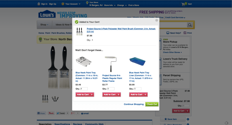
Still, this remains a very much non-digital object that is packed with useful information, and that serves as a guide not only in one’s journey towards “preparing” to paint, but extends the relationship into the painting process itself through chunking various tasks into categories, from “Job Prep”, to “Paint”, to “Clean Up”. This is not merely a tool for painting or measuring, but (with some interpretation by customers) a means of actually changing (and even teaching) painting behaviors. By trusting the object (and, by extension, the designer of the yardstick and the Lowe’s brand itself), the customer can get far more out of a visit to the store than they otherwise would have without the help of this yardstick. Placed in the context of the Lowe’s store, this object might cause customers to second-guess which of these supplies they’ve got at home, and in turn may “nudge” them towards purchasing more in-store. This yardstick is, in fact, the physical equivalent of this window that appears on Lowe’s website:
However, the analog version has the digital version beat in at least one key respect; while the customer will probably remember what they’ve bought (or be able to easily glance in their actual, physical shopping cart) during their time in the store, the algorithm on this site simply spits out the same items along with its desperate plea to “Wait! Don’t forget these…”. For example, add a paint tray to your cart and it will remind you to pick up some paint tray liners. Add the liners as well, however, and… you guessed it: it asks you to add (yet another) paint tray to your cart.
However, while it may outperform its digital equivalent in this respect, the yardstick’s creators made a few risky assumptions. Removed from the store (or the opportunity to easily purchase needed paint supplies), this yardstick may become, somewhat annoyingly, a reminder of all those important things you either
a) didn’t think you truly needed, but in fact actually did need, or
b) didn’t know what/where they were, and were too embarrassed/rushed to ask
There are ways to rectify the mistakes these assumptions might cause, though, before they lead to the unwanted outcomes of both customer frustration and more revenue for competitors.
Potential improvements
Include a guide next to each listed object, indicating precisely where in the store the object is located. (Might this be a good chance to use QR codes? If in the US, probably not (but if in China, possibly!). While you’d need to standardize item placement and aisle numbering across stores, this might already be something Lowe’s practices, making things simpler for them – not to mention simpler for someone trying to check off all the boxes on their shopping list yardstick. Basically, after this object asks the question “did you remember this item?”, a pretty fair follow-up question if they answer “No”, is “would you like to know where this item is located?”
When trying to better serve customers who don’t know what one of these items is, and, by extension (or due to a lack of time) doesn’t end up picking up a key item, good news: 1) I see lots of extra whitespace on that there yardstick, and 2) you probably wouldn’t believe me if I told you how many icons of paint rollers there are. A thoughtful and well-designed icon next to each item could impart a surprising amount of information around what that item is, what it looks like, and why it is necessary. Finally, placing a small picture of the item next to each word is also a big help If someone’s reading ability is impaired, either through illiteracy or dyslexia.
Ways to test those potential improvements:
An improvement is only an improvement if it actually “improves” things, and the only way to find that out is through testing it. One testing strategy is to put out buckets with a different type of yardstick in each (this would also require visually distinguishing the different types of yardsticks so that they could be easily told apart from each other at a distance). Place them alongside one another, and assign each type of yardstick an individual SKU barcode. From there, see which ones are purchased most frequently, and, equally importantly, what items are purchased along with them. How do these objects influence the behaviors of their customers, if at all?
To better understand actual on-the-ground usage behaviors around the yardsticks, have employees subtly follow and observe customers who choose the redesigned yardsticks to see how they use them, how they carry and consult them, how they hold them or place them on their carts, and so on. A change in the information displayed on the yardstick may also require a reconsideration of the yardstick’s form (or the form of Lowe’s baskets or shopping carts, for example).
If you do decide to go ahead and use a QR code anyway (or a truncated bit.ly web address, even) as a means of guiding customers, it would probably make the most sense to have it launch them into a lightweight mini-site that combines both a list of items and checkable boxes next to them, and also a physical guide to where things are located to make them easier for customers to quickly find. In this case, a count of the number of visitors to said mini-site would be easy to keep, and there might be additional insights to be gained from seeing the order in which objects are checked off on the site, and which objects most often remain unchecked. I know the temptation is there to make an app. Consider this, though: when rushed for time (and, like me, constantly facing a shortage of phone memory), by asking users to sign in with their Apple ID, download an app, wait for the download to finish, and then have them create a User ID and password for the app the best use of their time?
Good question.
* My thinking around this post came partially from an extended conversation/argument over Twitter yesterday with @Anthropunk about analog vs. digital touchpoints in service design. Turns out we weren’t really arguing, but that tends to be what Twitter turns into – extremely constrained, unpunctuated and brusque bursts of conversation causing you to entirely misinterpret what the other person is saying. Ah, well.