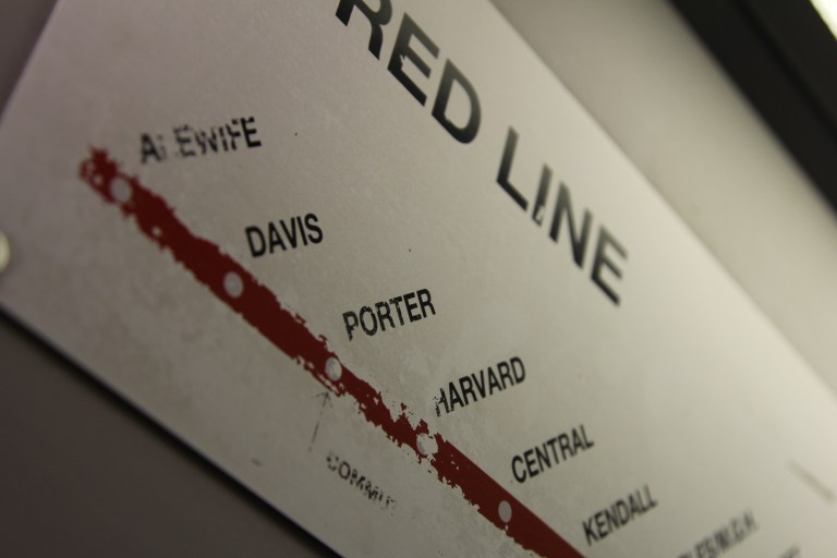
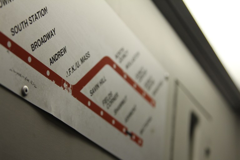
What can be inferred from how users have previously interacted with this public wayfinding element? This route map shows the potential journeys for passengers of Boston’s rapid transit system, the T. Although only one of many in-car maps, note what visible wear patterns might reveal (or conceal) about customers’ journey experience(s). Who might be interacting with this map (positioned above one of the doors at a height of about seven feet / two meters)? Why use this, instead of one’s phone, for example? Where might these passengers be coming from, and where are they trying to go? Do they touch this particular wayfinding artifact for comfort, or for help in explaining a route to a fellow passenger?
Finally, as wear patterns begin to erase relevant information on this map, think: when increasingly trends are to touch the “interfaces” around us (be they screen-based or wall-based, static or not), how can this best be designed for?
See also: Here-ish