When a given behavior is discouraged/undesirable, but not technically illegal, how do you design something to prevent people from doing it?
The varying levels of specificity that come with the stated desire to eliminate “junk” reflected in a diversity of different ways. In the entryway of this Lucerne apartment complex, comparable stickers speak in various tones and with differing degrees of emphasis. In one, a pudgy man sporting suspenders, a red bowtie blooming from his neck, eyes panicked and lips pursed, holds up a hand (presumably to would be deliverers of advertisements). Comic sans-adjacent (my designer colleagues cringing) lettering shouts in red. Despite the goofiness (to an American) of the tone, an address is written across the bottom, implying the vestiges of some sort of authority to back up the request made by this object (think of building signs signed “- MGMT”). They even kindly include a “danke” for good measure.

This sticker’s style stands in contrast to that on some of the surrounding doors, which make a more simple and “serious” request to not place advertising into the mail slot.

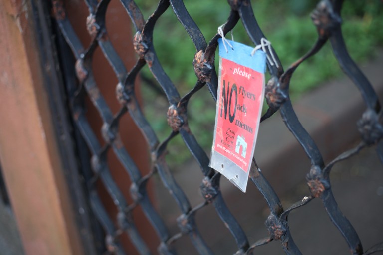
With a great number of standalone houses (increasingly inhabited by people with ever more disposable income), Brooklyn, New York serves as another context of diverse signage designed to repel advertisers and takeout menu-stuffers. As with the first example, some signs feature the name, logo, and web address of a local neighborhood organization, again presumably in an attempt to bolster the legitimacy of the threat that comes from disobeying. Here, a mix of sans serif “NO”, with serifs for the trio of disallowed things – it ain’t pretty, but nor is it meant to be.

In a nod to the ubiquity and familiarity of the form of a typical “no ads/menus/fliers” sign in this neighborhood, the maker of this sign abandons nearly most every other graphical convention: no explicit list of disallowed things, no organization – fake or otherwise – to back up the claim, not a particularly heavy use of the color red compared to others, etc. In retaining the dominant form factor of a square, laminated sign affixed to a front gate, I wonder whether the message is sufficiently clear (or at least not so unclear as to act as a temptation to ignore it) to would-be advertisers.
Consider what makes a sign explaining a rule more or less effective in a given context, what carries over to other contexts, and why.
