
Amsterdam will present an interesting case for explorers from the future. It certainly intrigues me, as I think about the gap between how a city negotiates the differences between how it wishes to be perceived, how people choose to perceive the city, and how those working on behalf of the city seek to bridge that gap.

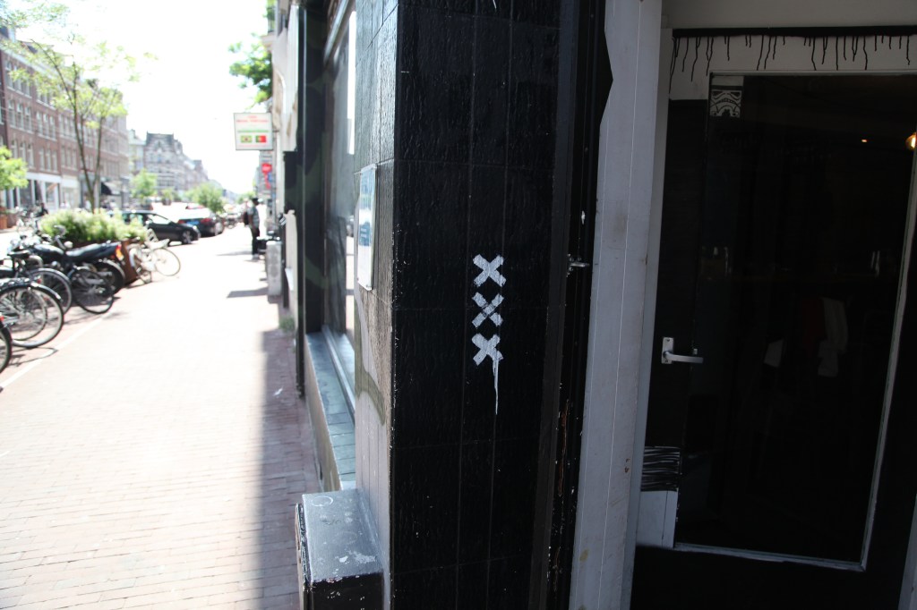
What I found particularly intriguing about Amsterdam are the things the distinctive (and typically red-on-white) “XXX” brand appears on. More than any other city I’ve visited that has had its own consciously public-facing and intentionally disseminated brand (like Chengdu, in China’s Sichuan Province), Amsterdam has placed their city’s insignia on to things that seem to reflect the deeper character of what the city is “about.” This, in turn, appears to have guided Amsterdammers’ decisions of how they employ the city’s brand as well.
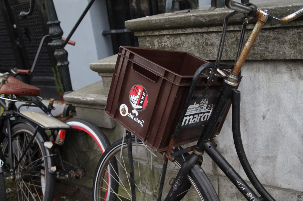
As this is Amsterdam, where bikes far outnumber people, the trio of X’s have found their way on to a lot of cycling-related infrastructure, from bicycle baskets:
…to bicycle ramps, the things that let people more easily navigate stairs and entryways with their bicycles – this image from a longer post unpacking Amsterdam’s colorful collection of infrastructure that both encourages and discourages all manner of four- and two-wheeled access:

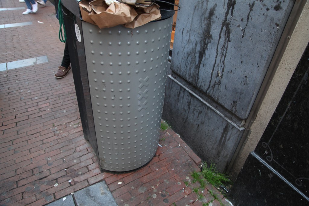
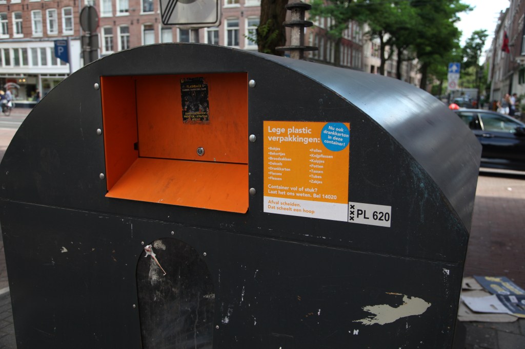
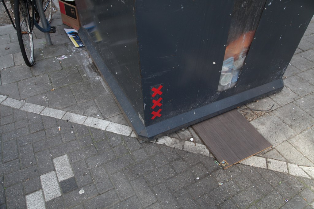
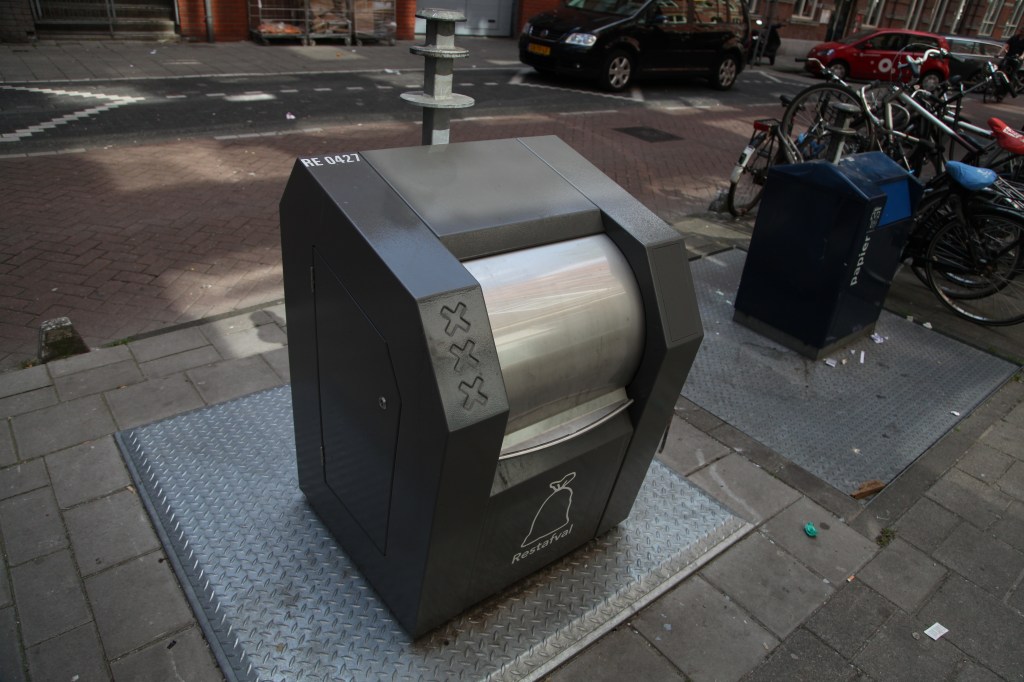
The brand appears particularly prominently on all manner of waste infrastructure, implying a pragmatic, unpretentious, and proud approach to keeping streets clean and waste meticulously sorted (reminiscent of an earlier post about how Lucerne, Switzerland thinks about waste and the inherent technological, socio-cultural, and economic inertia that shapes behaviors):
I particularly like this canal-side railing post support, because much like how the logo functions on a metaphorical level, literally holding the city together.

How does your current place tell it’s story about itself? What does it appear upon – and, just as notably – not appear upon?


